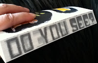
Chip Kidd's The Cheese Monkeys entertained me as an object before I even opened it up to start reading. It was like a puzzle. First, the edition I read has the title in pictogram format on the cover. Next, there are letters are printed on the edge of the book pages and you have to kind of bend it and fan the pages a bit to read what it says. Then flip it over and see another message from the other direction... cool! These cryptic words enticed me to start reading, so I flipped it open and encountered:
"The inside front cover was intentionally left blank. It's not a mistake. It's actually a separate 'piece,' entitled 'BUDGETARY CONSTRAINT NO. 13.'"
I was already chuckling before I even began the novel, an academic satire set in the 1950s. The narrator tells us:
"Majoring in Art at the state university appealed to me because I have always hated Art, and I had a hunch if any school would treat the subject with the proper disdain, it would be one run by the government."
He signs up for a new course, Introduction to Graphic Design, taught by an irascible genius. He falls in love with someone who is all wrong (and unavailable). He learns more than he expected.
Kidd, an award-winning graphic artist, has much to say about design in The Cheese Monkeys. It's a funny coming-of-age story with a little art theory thrown in. I loved it.
Readalike: Looking for Alaska (John Green).


No comments:
Post a Comment